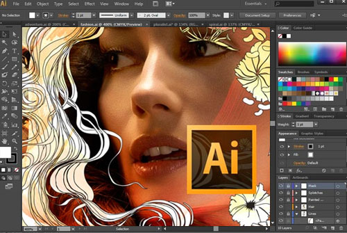
 In 2016, content marketing is no longer an option. It’s an imperative. We know this here at Creative Studios, as you can immediately tell since you’re reading this blog, all of our competitors know it, and so do all of yours.
No doubt you will already be aware of this fact also. As a business, you will of course have a website, and that website should have a blog.
Blogs are brilliant. They are the perfect tool for the modern-day marketer to add real value to a brand. Through your blog, you can make a regular address to your dedicated followers, provide them with the latest industry news, offer your expertise, deliver how-tos and tutorials, and truly make your website and your brand one of the most valuable resources in the industry (not to mention the SEO (search engine optimisation) benefits).
But there’s a catch.
You’re not the only business in your niche to have cottoned-on to the wonderful world of blogging.
No, as we’ve already highlighted, all of your competitors are blogging away like mad as well. And so, the question you need to be asking yourself is – how do I make my blog better than anyone else’s? How will my blog blast my rivals’ out of the water?
Adobe Illustrator For Blogging?
I know what you’re thinking – blogging is all about the written word, and Illustrator, well, isn’t.
Great observation, and you’re of course very sharp to bring this point up. But, I feel that I shall have to correct you.
Yes, of course, blogging is primarily about delivering written information to people over the internet. However, when marketing your blog over social media, it’s the visual appeal that’s going to make people click.
Social media has gone visual – there’s no doubt about it any longer. Which, sadly, for the blogger at least, means that nobody is ever going to click through on a blog link unless there’s a pretty cool and captivating image attached to it. Of course the headline plays its part, but you really need both in this day and age.
What’s more, when people do actually arrive at your blog, it’s not enough to just have written information. Again, users need something visual. The featured image needs to be bright, relevant and captivating, and then, as we scroll down, we like to see the text broken up with a few more visuals as well.
Indeed, nothing is more off-putting than a blog that’s literally got nothing else to offer than a few hundred words of dense text. It looks boring – and even if you’ve managed to pen the very best blog post with the wittiest and most interesting narrative the internet has ever known, no one’s going to give it the time of day if it just looks dull. The assumption will be that if the page looks dreary, then the rest of the blog, the website, and the brand will most likely follow suit.
Nobody can afford to take this risk in the digital age.
So, let’s now check out how you can use Illustrator to instantly give your business blog a supercharge and keep that traffic coming thick and fast.
How To Use Illustrator To Supercharge Your Business Blog
1. Blog Post Graphics
Perhaps the very best way to make your blog stand out is to start designing your very own blog post graphics. Many companies resort to using stock images to add the visual element to their blog posts. But, those that create their own – and you can tell the ones that do – really make an impression on readers.
The reason is that they suggest that the blog creator is going the extra mile, that indeed they are taking the art of blogging seriously. This isn’t just another run of the mill content-regurgitator, but a place where original thoughts are being bolstered with original graphics.
Adobe Illustrator makes it super easy to create custom graphics, and it allows you to create templates, which will save you time in repeated efforts. With a little effort, you’ll be creating blog post images with Illustrator that will simply scream out “Click and share!!” to anyone who comes across them.
2. Infographics
If you really want to get visual, then you need to be creating your very own infographics. Infographics are extremely popular on social media, and in particular Pinterest. The reason is because they are a highly visual – and therefore highly shareable – way of displaying information.
A good infographic is one that focusses quite heavily on statistics that are displayed visually, using graphs and other illustrations. The information becomes memorable when we visualise it like this, and so too does the whole rhetoric of the piece. That is to say that you can spend many hours devising blogs that very acutely and persuasively make your point. But, really, what better way is there to get across the point that gorillas are hairier than chimps than by having a funky illustration of each juxtaposed on an infographic with some impressive figures in large type over their hairy heads? (You will of course use your own example, but you get the idea.)
3. Custom Sidebar And Share Buttons
Buttons are of course the perfect way to make your blog interactive. Everyone uses them of course, but, if you design your own then you can start to differentiate your business and add real interest to your brand.
With Illustrator you can very easily create colourful and interesting category buttons for your blog or share buttons that are like nothing else on the web. And it’s actually very easy to do.
For instance, you can use the ellipse tool to create a circle, the pen tool to draw some bespoke icons, then use the eye-drop tool to insert the colours of your brand, save them as transparent JPEGs, upload them to your sidebar and links to turn these graphics into clickable buttons. Easy.
If you liked this blog, then you’ll love some of our previous posts. Check out ‘Adobe Illustrator For Beginners’ and ‘Design A Logo In Illustrator’ for some more great reading.
Alternatively, if you’re already comfortable with the basics, then why not get more advanced by signing up to one of our Illustrator training courses. See the full list of what’s coming up here.

 Click here to see all of our Software Training Courses


2 thoughts on “How To Use Illustrator To Supercharge Your Business Blog”