With all the viral delights of today’s digital world, it can be very easy – and erroneous – to forget the power of good old-fashioned brochure advertising, for which there is still a much honoured place in the marketer’s arsenal.
Easy to read, and, if designed to a good standard, the printed brochure can in fact be a true catalyst for brand awareness.
The real world has yet to be completely usurped by the ever-encroaching techy tendrils of the digital, and in truth it never will.
There will always be a need for printed, physical media, no matter how overbearing the digital counterparts may seem. Indeed, just like we will always want be able to pick up a book to read or a newspaper, we will also always want to flick through a leaflet or brochure – and marketers will do well to acknowledge this.
Adobe All The Way
To create an eye-catching and captivating brochure design, let me tell you Microsoft Word is not the way.
Word is great for text-based documents – but its functionality becomes painfully restrictive when it comes to design. Indeed, you can spot a brochure that’s been fudged together in Word a mile off, and you will be forgiven for cringing, tutting, recoiling or even throwing up right where you stand. They really are awful.
This is where InDesign comes into play.
If you are convinced by the remaining marketing power of the printed brochure, then it is to Adobe that you must turn as you cast your eyes decisively away from Microsoft’s offerings. We all have our strengths, but design is not one of Word’s.
Over this two-part tutorial, you will learn that great designs are only made from great design software, that the great design software you need is Adobe InDesign, and how to use the great Adobe InDesign to create a fantastically designed brochure.
Here in Part 1 we’ll be covering the basic brochure design principles that we all must adhere to when crafting brochures, and in Part 2 next week we’ll deliver your walkthrough guide to designing a brochure using InDesign from scratch.
Brochure Design Principles
So, let’s begin with the lowdown on some basic brochure design principles that should be observed for best results.
Layout
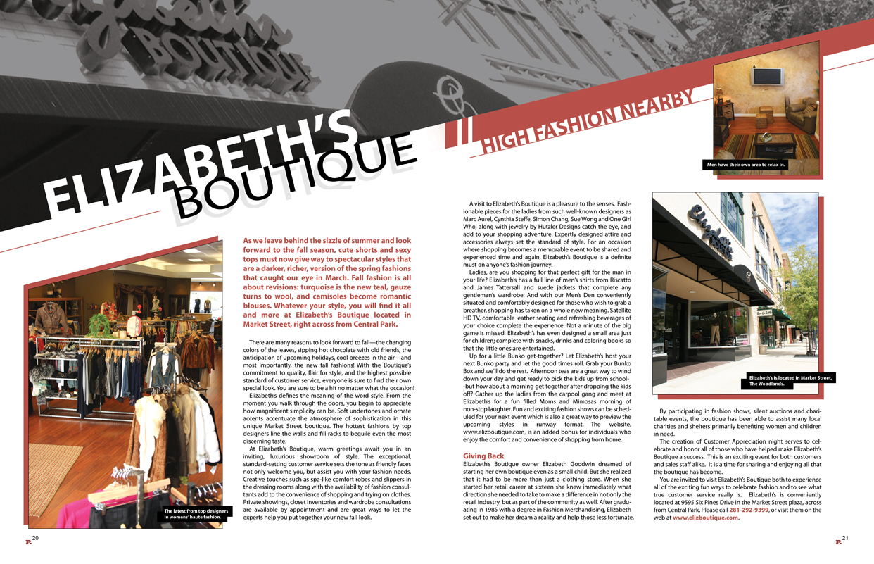
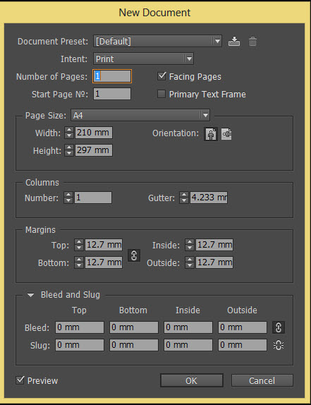
The first thing you need to do is check (and double check) the size of the document. Decide on the size you want the document to be when printed, and set this before you start work. Believe me when I say it’s a hard thing to change once you’ve started, and may end in you having to begin the whole thing again from scratch.
To resize your document, go to File > Document Setup. Select the appropriate page dimensions and click OK.
With these set, you can start thinking about where to start placing your texts and images.
Arrangement
Eye-tracking studies have revealed that readers of documents focus most heavily on the top left side of the display – it makes sense, then, to place your brand logo right here and implant it into the mind’s eye of your reader.
As for the rest of the document, one of the most important things to remember is not to place content too near the gutter – i.e. section(s) marked by the pink lines going down the page. It is in the middle of these lines that your printed brochure will be folded, and so you need to keep your content a safe distance away so that nothing gets lost or distorted when the folds are made.
Indeed, the use of consistent spacing throughout is imperative. Keep the same spacing between blocks of text, images and gutter lines throughout the document, giving the whole piece a uniform appearance.
Best practice here is to keep all separate elements of the piece in individual bounding boxes, which will allow you to freely move text blocks and images around the document completely independent of one another. You will even be able to make the most minute of spacing adjustments like this – look out for Part 2 where I explain how to use bounding boxes in more detail.
Fonts and Headings
Fonts and headings should not be glanced over too lightly. Indeed, they can be the make or break of your brochure.
Begin by researching popular fonts that are en vogue right now – trends happen for a reason, and ensuring that you’re current will be crucial to your brochure’s appeal. Check out the MyFonts website for updates on the 50 most popular fonts being used by designers.
Being stylish is one thing, but the font you choose must of course remain relevant to your brand and your products. With this in mind, it’s important not to over-style your headings, as this can be confusing and hard to read – the exact opposite effect to what you’re trying to achieve.
Headings are the most important text on the page – get them right and you’ll have your audience in the palm of your hand.
When you think you’ve got the font(s) nailed for your body text headings, as well as sizing, there is also spacing to consider.
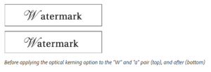
The process of adding or subtracting space between pairs of characters is known as kerning. When you type your headings, it’s advisable to experiment with kerning until you get the spacing that you feel it looks just right.
(Image source: helpx.adobe.com)
Text
There are some general principles of text design for brochures that you must observe for the best results.
Number one – never ever underline words, use bold type, or both for emphasis. The contrast with the rest of the text is just too much, making these highlights visually distracting with regards to the document as a whole. Indeed, they actually draw the eye, when all you’re really after is a little emphasis.
Instead, simply use italics to add stress to certain words. It’s far more elegant and professional, and doesn’t distract from other visual elements of the brochure, which will naturally be more important than a random word out of context.
The other important things to avoid are Widows and Orphans.
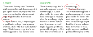
Orphans are words or lines at the end of a paragraph that are left dangling all alone in a new column.
Widows are typically single words that form a new line at the end of a paragraph.
The image below from edgee.net will help you visualise what I mean.
Although there is some dispute or irregularity amongst sources as to which is which – i.e. what some describe as a widow, others, describe as an orphan – I choose the above definitions because to me they make the most (slightly saddening) sense of the metaphor. That is to say that widows find themselves left at the end, whereas orphans are left at the beginning.
Fixing widows and orphans may require manual editing – subtle rewrites of the text itself can help paragraphs fall more favourably. Alternatively, you can use Adobe’s Compose Text tool, or read Matt Smith’s extensive blog on the subject – ‘Five Techniques For Fixing Widows And Orphans Using InDesign And Illustrator’ – for some more ideas.
Colour
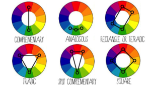
Get to know your colour palette. Some colours when used together – such as a green font on a red background – are big no-nos. There is an excellent series of blogs by Smashing Design – ‘Colour Theory For Designers’ – that everyone embarking on design should read.
Another good reference site is Tiger Color – their post ‘Basic Color Schemes’ gives you the full break down of using the colour wheel to create colour harmonies – essential knowledge for the designer.
(Image source: oss.adm.ntu.edu.sg)
Once you’ve got to grips with your colour harmonies and have chosen the most appropriate one for your brochure, the most important thing now is to stay consistent. Don’t be tempted to use one colour in a random place that is seen nowhere else in the document – this is just as hard on the eyes as over-styled font headings.
This concludes Part 1. Look out for Part 2 where we’ll be taking you on a walkthrough guide of brochure design using InDesign. Stay tuned!
Want more? Book into your InDesign Training Course today, and get the most out of this great program with expert guidance from an industry professional. Read our post ‘What You Get From A Creative Studios InDesign Training Course’ for the full details, book now online, or use our Contact Page to find out more.

 Click here to see all of our Software Training Courses
One thought on “How To Create a Professional Brochure Using InDesign (Part 1) – Design Principles”