What does the colour red mean to you?
For me, it’s most definitely a colour that resembles power and desire. Though for others, this same colour signifies danger. Still more would say that red is the colour of love. And even more still would say it connotes blood, death and/or romanticism.
In truth, red signifies all of these things – though of course they are determined by subconscious cultural forces over which we have little or no control. Indeed, the colour red has strong associations with communism in Russia and other parts of the world – though perhaps less so in the UK.
And so, the power of colour can never be taken too lightly, and for the graphic designer – even the amateur one – this means that the colouration of your brochure, website, business card or what have you needs to carefully considered.
What Else Does Colour Achieve In Design?
Many things.
Aside from evoking emotions, colour is used to organise content, place emphasis, attract attention, and generally aid in the creation of an aesthetically pleasing design.
Indeed, no matter if you’re touching up a photo in Photoshop, designing a logo in Illustrator or crafting a beautiful brochure in InDesign, your choices when it comes to choosing and placing colours can make all the difference between something that’s revered by your audience and something that’s rejected.
It All Comes Down To Colour Combinations
Anybody who wants to try their hand at graphic design should make themselves familiar with colour combinations as are determined by colour theory.
Colour theory is the study of colour in art and design, and tries to make scientific sense of the relationships between colours, and understand the principles that are used by designers and artists – often intuitively – as they form pleasing and harmonious colour schemes.
This blog post will give you the essential run down of the colour wheel and talk you through the basic colour chords and schemes that will put you in good stead for when you approach your next design project.
The Colour Wheel

Believe it or not, the concept of the colour wheel was first invented way back in 1666 by Sir Isaac Newton. Newton managed to bend the colour spectrum – which, combined, makes up all visible light – into the shape of a circle.
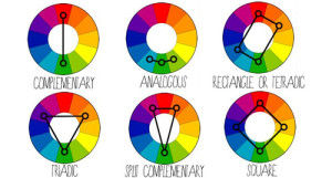
This circular diagram, like the one in the image provided above, can be used to show the relationships between colours and create logical colour schemes.
Let’s now take a look at how colours break down, and consider how you may start to craft your own colour schemes when embarking on graphic design with Adobe products.
Primary Colours
This is something I remember first learning in primary school, and so there’s every chance that you might too.
Can you remember what they are? Red, blue and yellow.
These are the most basic – or perhaps the most pure – colours on the colour wheel. Much like prime numbers, no other colours can be blended to form any of these three colours, and yet all other colours on the colour wheel are made of them.

In design, primary colours are often used together to draw attention – their strength is their most important feature. The Burger King logo is perhaps the most famous example of all three in action together.
Secondary Colours
Green. Orange. Purple.
Those are your secondary colours, and are formed by mixing equal amounts of the two primary colours that are directly adjacent either side on the colour wheel. So green is made by mixing blue and yellow, orange by yellow and red, and purple by red and blue.

For design purposes, using a secondary colour can create a beautiful foil for a primary colour, which will jump right out. Here’s the Fanta logo (keeping with the junk food theme) – notice how it’s the blue lettering that you notice, propped up first by the orange and then the little flick of green.
Tertiary Colours
Tertiary colours are created when you mix a primary and a secondary colour together.
The options for tertiary colours are pretty much infinite – and of course tints and shades can be used by blending black and white into tertiaries.
And so, now we need to consider how we turn all of this knowledge into beautiful colour harmonies.
Colour Harmonies

Luckily for us, artists have been experimenting with the colour wheel for centuries, and so there is already a whole host of theory that will help you create the perfect colour harmonies for your designs with practically no trouble.
Complimentary Colours
Very simply, complementary colour schemes are created by taking two colours that are directly opposite each other on the colour wheel. They provide the maximum contrast, and work particularly well when cool colours are paired with warm colours.
Analogous Colours
This colour scheme is created by using two or three colours that are adjacent on the colour wheel. There is little in the way of dramatic contrast, but will always sit well together because they are essentially made up of different amounts of common colours.
Tetradic Colours
Also known as double complimentary, a tetradic colour scheme is made my using two pairs of complimentary colours. Of course, when using four colours, the risk is that there can be too much colour – especially if you’re working on a very simple design. Therefore, if you do go tetradic, you should usually not use all colours in equal amounts, instead allowing just one or two to be dominant.
Triadic Colours
Much like the classic 1st, 3rd and 5th triads in music striking a beautiful major chord when played together, the triadic chords on the colour wheel are equally pleasing – though on the eye rather than the ear, of course. They are formed by selecting three colours that are equidistant around the colour wheel and create the perfect balance – though that is also to say that the contrasts are never as striking as when using complimentary colours.
Split Complimentary Colours
The split complimentary chooses one colour, and then the two colours directly adjacent on either side of its complimentary colour (see diagram above). This scheme takes the edge off the contrast of the complimentary colour, though still provides striking results.
Book up on one of our InDesign Training Courses now and learn more about colour schemes in graphic design under the guidance of one of our expert tutors.
